Gerard is a graphic designer whose work mostly happens after the design exists: taking rough or raster artwork and making it press-ready — clean vectors, colour reduction, spot-colour separations, Pantone specs and tech packs a printer can run without a phone call. Over 500 of those tees have sold at retail, worn by athletes and programmes across the WNBA, MLB and NCAA — from 90s bootleg streetwear to game-day drops.
He needed a portfolio that could explain that job to people who hire for it. Not a grid of pretty thumbnails — a site that shows the production side as the craft it is. I designed and built it end to end, and it's live at the link in the sidebar.
The brief
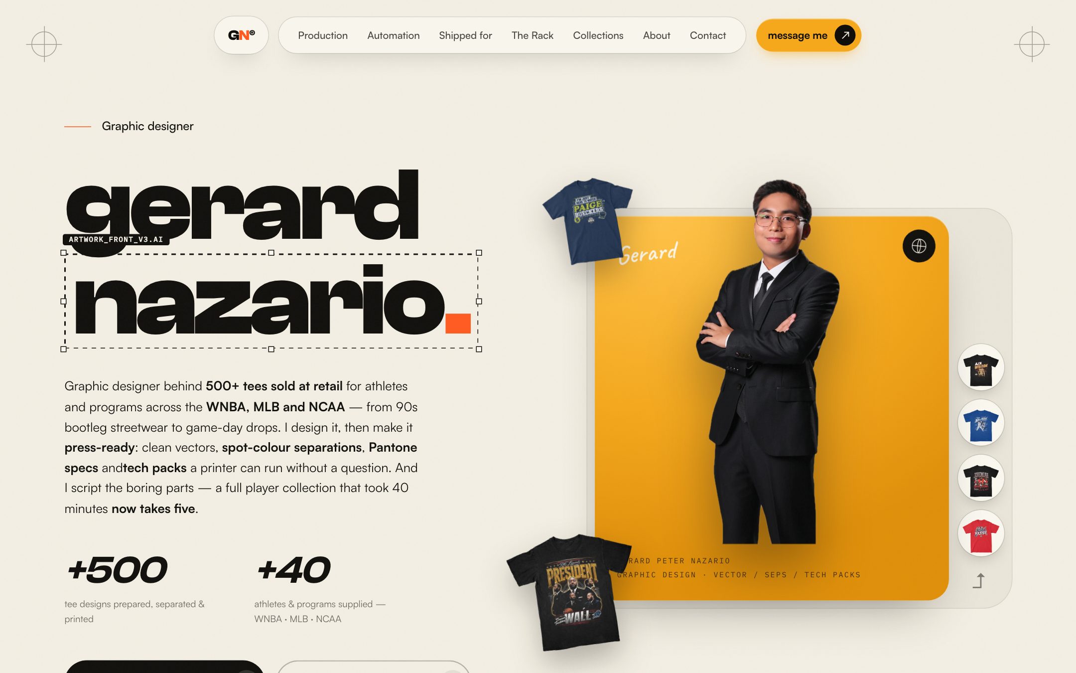
Three things had to land in the first screen, in this order:
500+ tee designs prepared, separated and printed; 40+ athletes and programmes supplied across the WNBA, MLB and NCAA. Two counters, nothing else.
“Not brochures. Not socials. Artwork that prints.” The site says it in the second section and then proves it with a tech pack.
The logos of every programme his tees were sold for, and every one of the 239 printed designs, browsable.
Designing like a production floor
The visual language comes from the print shop, not from the designer-portfolio template: a warm paper ground, one hot orange accent, a heavy grotesk for the headlines, and mono labels everywhere a spec would sit — TECH PACK · TEE-0142 · FRONT / BACK / SLEEVE, REV 03 · APPROVED, PMS 1235 C. Everything that would be on a real production sheet is on the page.
The centrepiece is a tech pack, drawn as a live diagram.
Front, back and sleeve placements with dimensions, collar offsets and colour counts; the Pantone swatches, mesh, halftone and file specs beneath; and the pre-flight checklist he runs on every file. All HTML — no image of a PDF.
Colour count, mesh (156 / 230) and halftone (55 LPI · 22.5°) are the same fields a supplier would ask for.
Eight checks — paths closed, text outlined, spot swatches only, Pantone per swatch, 100% print size, file naming — shown as the standard, not a footnote.
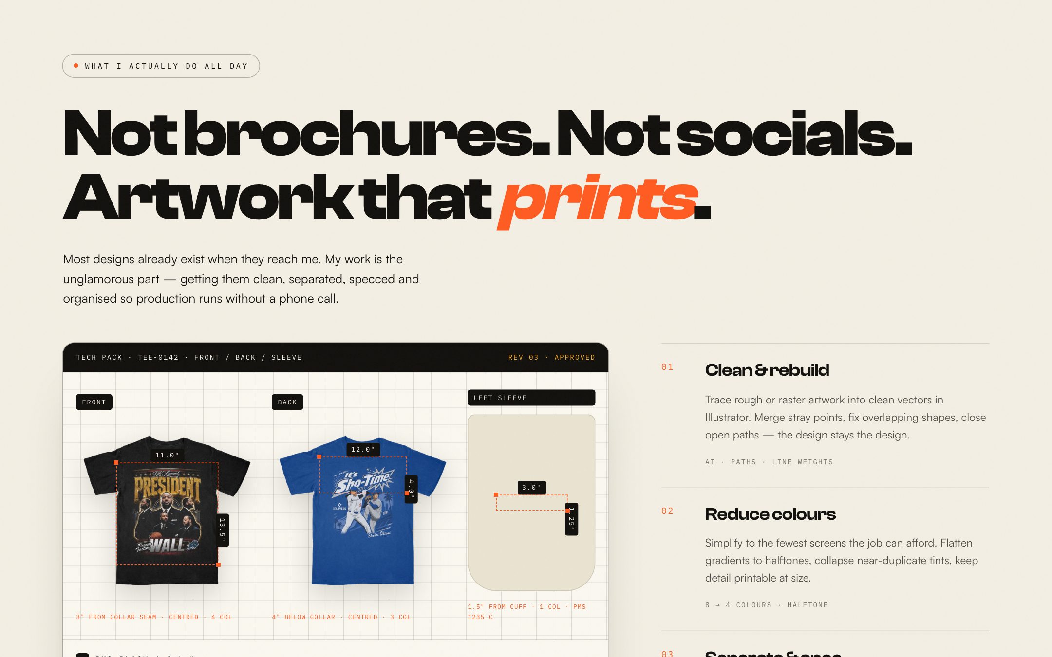
Beside it, the four-step process he runs on every job — Clean & rebuild → Reduce colours → Separate & spec → Tech pack & revise — each with a one-line mono summary (8 → 4 COLOURS · HALFTONE, PMS · SPOT · UNDERBASE). The rotating marquee above the section repeats the services as a print-shop strip.
The automation story
Gerard also scripts the boring parts. Every new athlete used to mean building a full tee collection by hand — folder tree, file naming, exports, specs — 30–40 minutes per player. He standardised the source files and wrote scripts so onboarding runs itself in five.
That deserved its own section, told as a before/after: the manual list on the left, the scripted one on the right, and a terminal-style run log in the middle that plays through the real steps with timestamps — scan, pre-flight, folder tree, rename ×36, export, tech pack, done at 04:58.
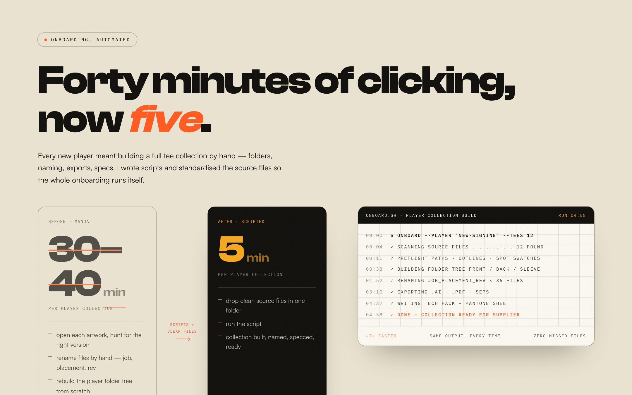
~7× faster · same output every time · zero missed files. The three lines under the log are the whole pitch for the automation, and they're his numbers, not mine.
Shipped for, and the rack
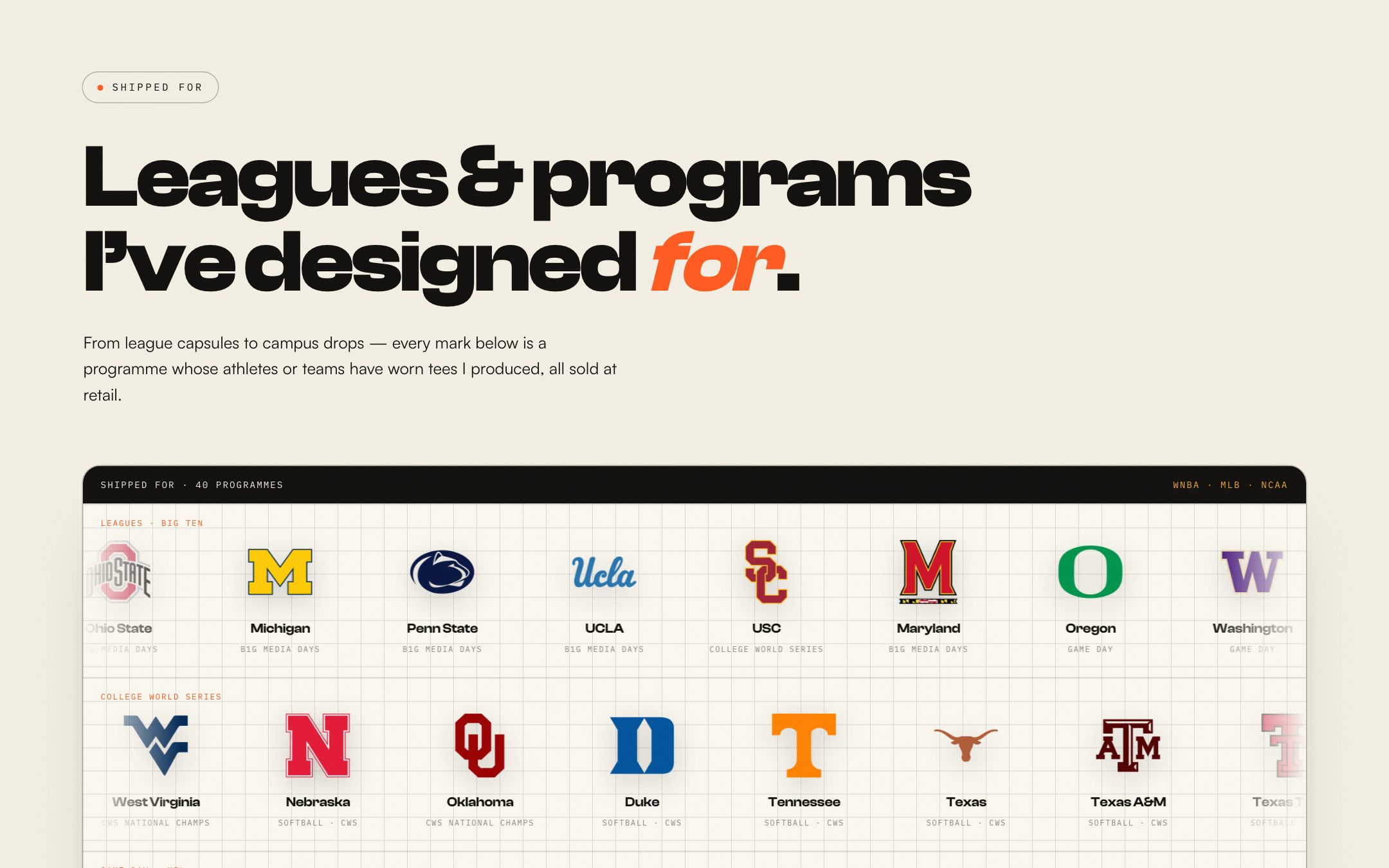
Proof comes in two forms. First, a logo wall of 40 programmes grouped the way the work was — Leagues & Big Ten, College World Series, Game Day & NIL — each mark captioned with the drop it came from (B1G Media Days, CWS National Champs, Blue Turf). Rows scroll on their own and pause on hover.
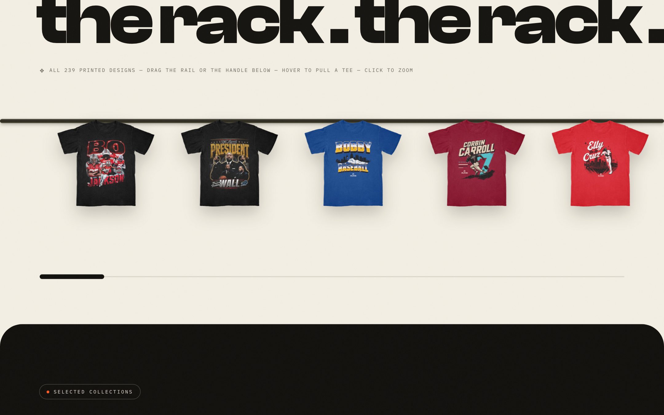
Second, the rack: all 239 printed designs hung on a rail you can drag, with a scrub handle below. Hover pulls a tee forward; click zooms it. Each tee carries its name and series — Bo Jackson · Two-sport legend · Retro, A'ja Wilson · That Girl University · WNBA, Shohei Ohtani · MLB Series — so the rack doubles as the index of his work.
Build notes
Next.js and React on Vercel, Tailwind for the layout system, Framer Motion for the reveals and the marquee strips. The tee images are WebP with sizes tuned for the rail so 239 of them scroll without jank; the logo wall uses CSS animation with prefers-reduced-motion respected. The whole thing is a single page with anchor navigation — Production, Automation, Shipped for, The Rack, Collections, About, Contact — because that's how a client reads a portfolio: top to bottom, once.