Every engineer says they “have an eye for design.” This notebook is the receipts. Before and alongside the products in the other chapters, I worked as a commissioned designer — a concert's entire merch line, apparel, phone wallpapers, a department flaglet, an animated ad — real clients, real print runs, real deadlines.
None of it is UI, and that's the point. Hierarchy, typography, color systems, and restraint were trained here — on things people wore, clipped, hung, and held — and then carried into every interface in this portfolio.
One system, a whole merch line
On April 13, 2024, Whee In of MAMAMOO played BEYOND: Manila. I illustrated and designed the fan-merch line for the show — every physical piece a fan clipped to a bag, wore around their neck, or took home. The rule I set early: one visual system — a turquoise doodle pattern, a hand-lettered logotype, orange accent strokes — that had to survive five different print formats without falling apart.
The artwork comes first.
A pen-tool vector portrait of Whee In — every shape a closed path, so it scales from a sticker to a tarpaulin without losing an edge. A second illustration, red-haired and framed with butterflies, became the souvenir card.
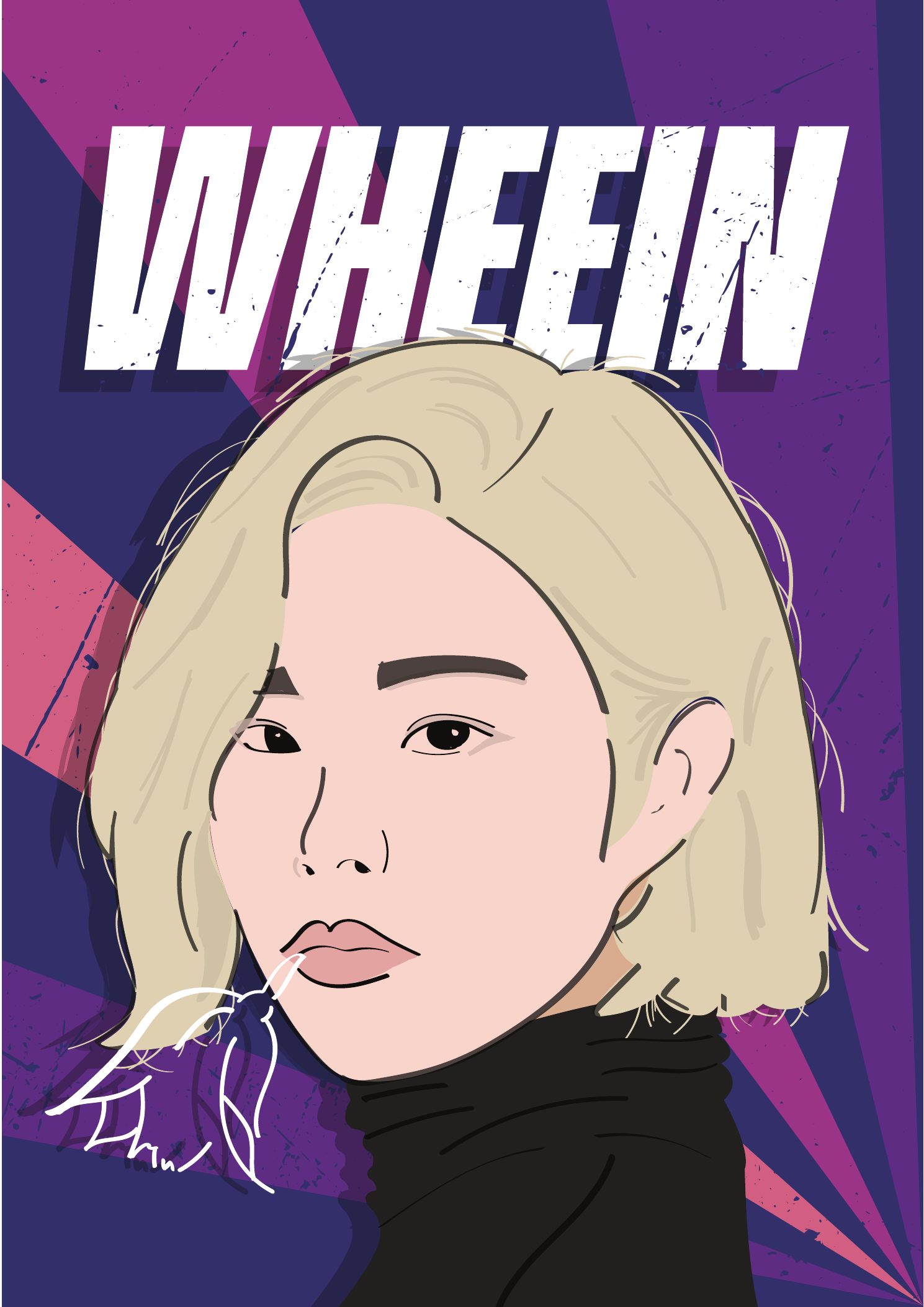
Hand-traced vector work — the linework, the flat planes of the face, and the ray-burst background are all editable paths, not filters.
The poster portrait and the souvenir-card portrait are separate illustrations sharing one hand.
 Bag tag
 PVC ID
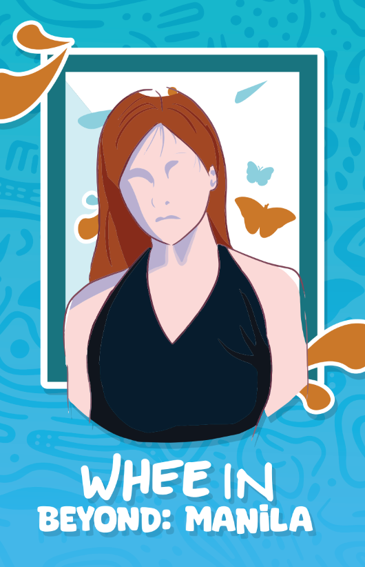 Souvenir card
The straps are the stress test. A keystrap runs about 13:1, a lanyard closer to 36:1 — ratios where most identities dissolve into a smear of color. The system holds because it was built from repeatable parts: the doodle pattern fills any length, and the logotype repeats like a heartbeat down the strap.


Every piece went to print and into fans' hands on show night — five formats, five aspect ratios, one visual system that never breaks character.
Shirts that survive the print shop
Apparel teaches a different discipline: silkscreen budgets, ink counts, and placement rules. Two briefs, opposite directions. STEM 12-1 at Congressional Integrated High School wanted a graduating-batch shirt that felt like streetwear — so the back panel is a single-ink acid-graphic collage: a wireframe globe, a DNA helix, an atom marking '23, and an impossible staircase for four years of climbing. Fluor, a Fortune 500 engineering firm's local team, needed the opposite: knowing when to stop. A wordmark on the back yoke, a badge on the chest, nothing else.
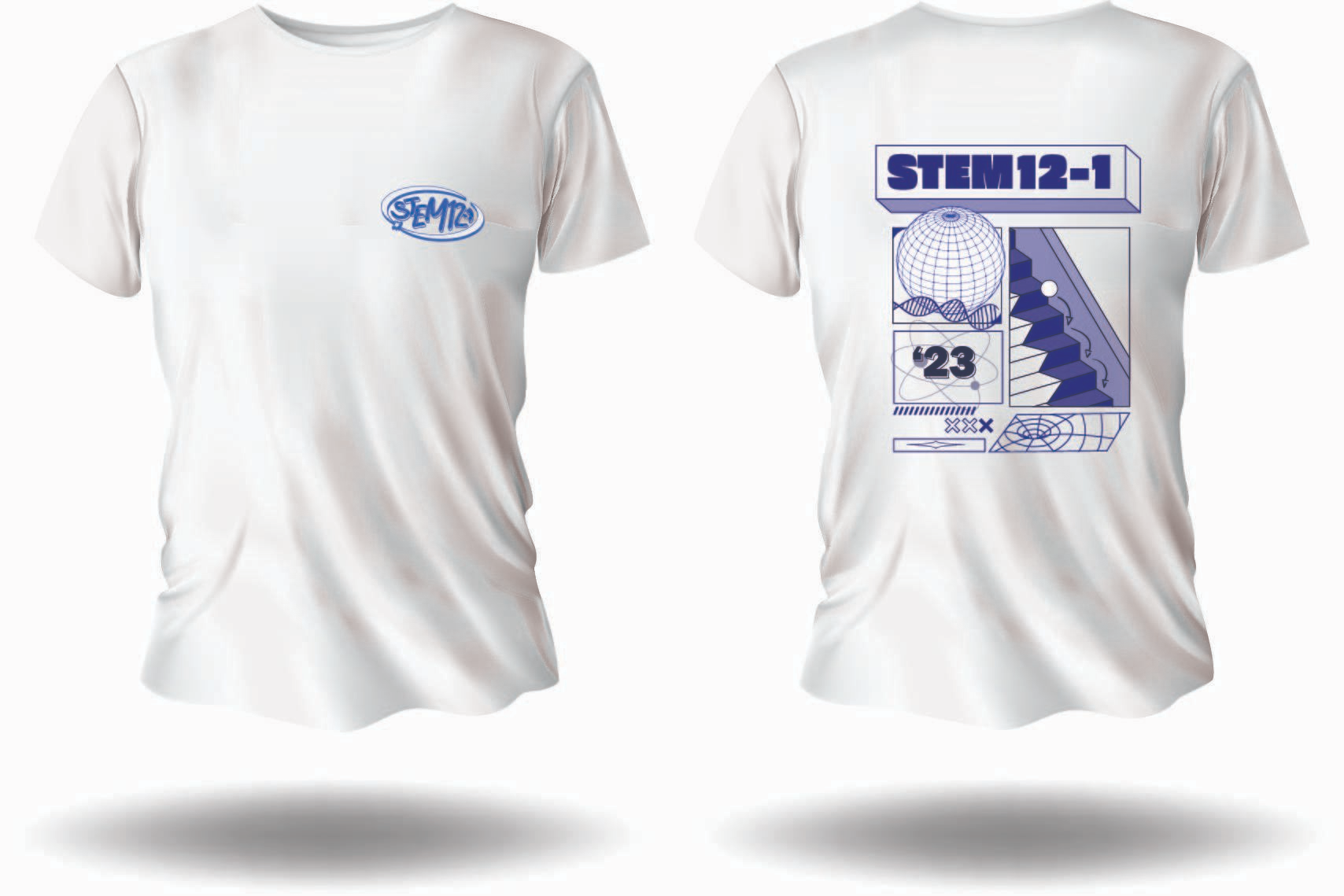
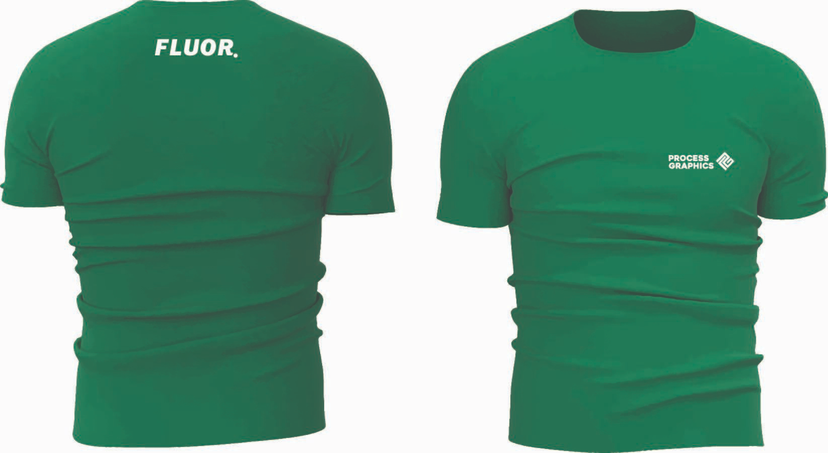
Same brief, opposite moods
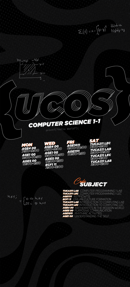
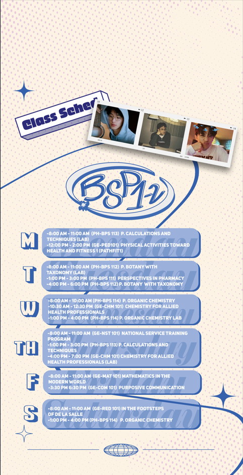
Commissioned lock-screen wallpapers that carry a university student's full weekly schedule — a legibility problem disguised as a decoration problem. The computer-science student got black-on-black: chrome outline type, calculus scribbles, halftone swirls, with the timetable pulled back into crisp white. The pharmacy student got cream paper, baby-blue sticker type, and a photo strip. Same information architecture underneath — day rails, time blocks, a subject legend — two completely different skins.
A flag for the nursing eagles
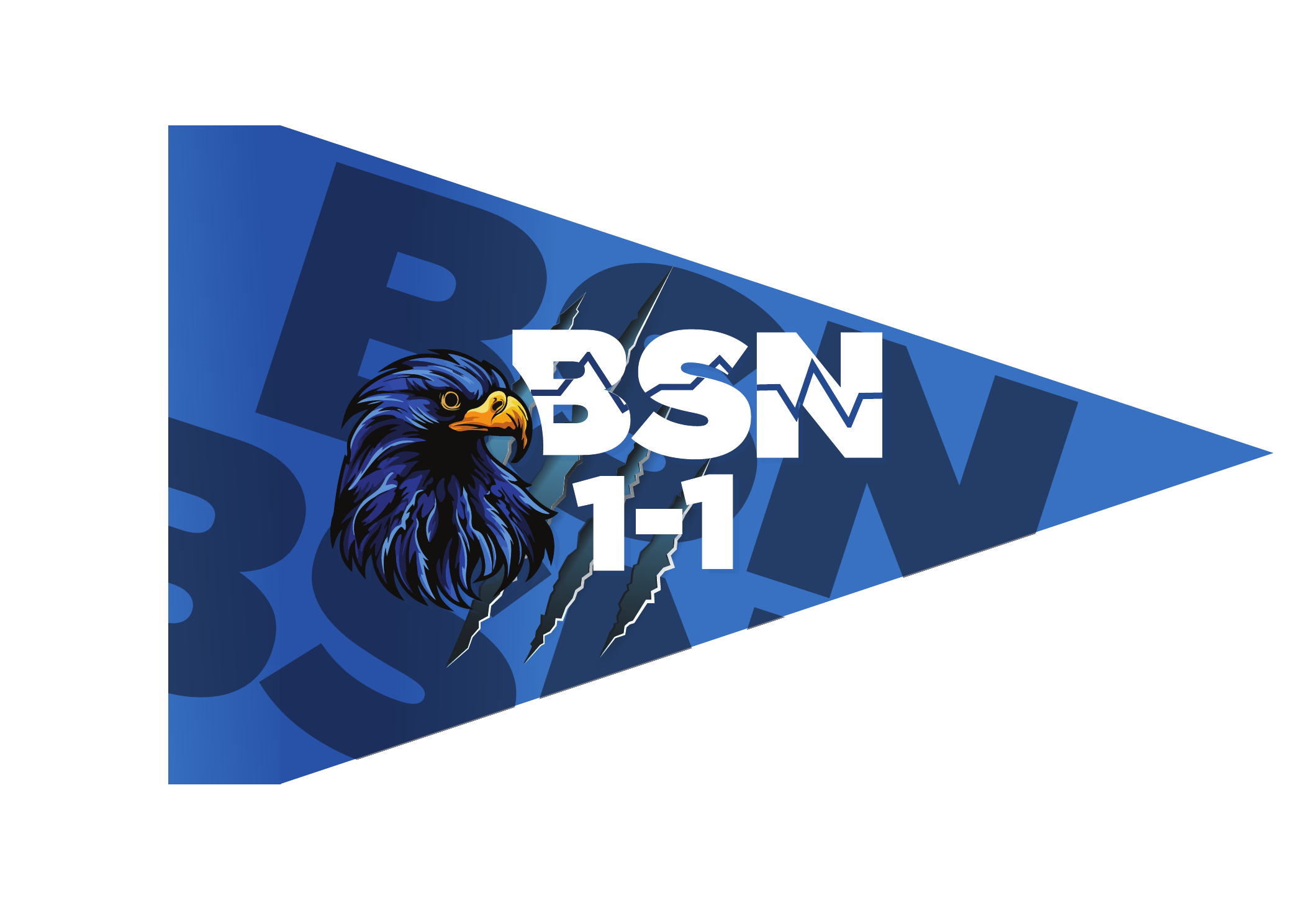
For the BSN 1-1 nursing section at Cavite State University: a pennant flaglet built around their eagle. The wordmark carries an EKG heartbeat carved through the letterforms, claw slashes tear through the blue field, and an oversized ghost monogram fills the triangle so the flag reads at distance as well as in hand.
Making it move
Back in 2021, the most popular K-pop sticker seller in the Philippines needed a shop-open ad for Facebook and Instagram. I animated their hand-drawn mascot into a 30-second spot — linework drawing itself in, sticker characters peeking into frame, ending on the shop card. Motion stuck: it later became a paid craft, cutting 10+ short-form reels a month for Team Fridays Marketplace with a 40% lift in post engagement.
Motion also works at the identity level. This ROMA logo sting builds the monogram bar by bar — each shape sliding into place with its own shadow — before the wordmark stamps in. Twenty seconds of animation that makes a static mark feel engineered.
Why this notebook sits on the shelf
Every dashboard and app in the earlier chapters looks the way it does because of this work. Print teaches you hierarchy, because nobody scrolls a lanyard. Merch teaches you systems, because one artwork has to survive five formats. Commissions teach you restraint, because the client's message outranks your decoration. That's the eye I bring to UI and UX — trained on paper, fabric, and film before it ever touched a screen.